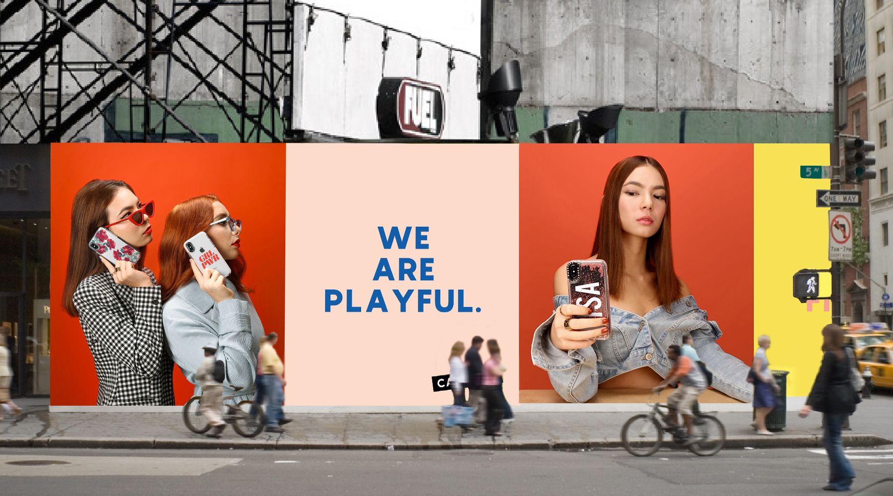

Welcome to the new CASETiFY.
Real Cute, Real Tough.
After almost 7 years in the making, we hit the refresh button.
What started as a simple idea--to make your Instagram photos into custom phone cases--has now turned into the ultimate case maker for everyone with self-expression at our core from the start.
People evolve, so did we. With our new look, you can expect the same high quality cases that are built to be dropped. We've got you covered.
Keep scrolling for more.
YASS! We got a new logo.

Designed Just For You

Me, Myself & CASETiFY
We're big believers in self-expression, so we wanted to embody just that for the dreamers and playmakers who settle for nothing less than the best for their phone cases!
With that in mind, we collaborated with our friends at Afterall Studio to get back to the core. Our logo & packaging were refreshed, realigning them to what it means to stand for individuality.
Expect a lot more vibrant color, jazz, and even custom giphys to spice up your mirror selfie IG stories -- just try searching CASETiFY on the gram.
Don't blink. We've still got a few things up our sleeves that we think you're going to love.
Sit Down With Our Designers
Allison Henry Aver and Joanna Bean Martin
"CASETiFY is a brand that's willing to be a part of the conversation and take risks creatively."
What is CASETiFY?
CASETiFY is the fastest growing global tech accessories brand, reaching 1 in 7 millenials. CASETiFY has become the publisher and platform for creativity and self-expression to connect individuals. Key collaborations include Pharrell, Sarah Jessica Parker, Saint Laurent, Thom Browne, and many more. Additionally, CASETiFY has partnered with key retail partners including Nordstrom, Revolve.com, Shopbop.com, Anthropologie, Amazon, AT&T, Lane Crawford, and more.
What was your inspiration for the new logo?
Refreshing a brand with such a wide variety of products means the logo has to do a lot of heavy lifting. It needs to evoke the spirit of the brand without detracting from the products themselves. Through many conversations and strategy discussions, we determined that CASETiFY's brand is one that is bold but not outlandish. It has to feel energetic but not goofy. So what we ultimately created was something that is both clean and easy to read with a little bit of a wink.
Our inspiration for the logo was based around the idea of stamps, stickers, and tape—which are all things people use to personalize things they own.
We wanted to design a logo that spoke to CASETiFY’s spirit of individualism and how CASETiFY empowers people to express themselves. The logo is at an angle to feel like a sticker and the dot in the “i” is meant to look like a person. We looked at more straightforward and simpler options but determined that a brand with personality deserved a logo with personality!
What was the biggest challenge working on the rebranding project?
Sometimes the simplest design is often the hardest. But in this case, the CASETiFY's team didn't have to say it--we knew this is what we ultimately all wanted, regardless of how hard this was going to be. We spent many hours distilling designs down to their simplest forms. Hundreds of design concepts edited down to just a few directions.
Another challenge was to keep the brand feel spirited, fun, and energetic without making it feel too juvenile. We wanted to make sure we expressed CASETiFY’s energy, but also reference that it is tapped into fashion, culture and trends. That’s where the finesse comes in.

For our logo applications, why the focus of the C, the black blocks, and what inspired the confetti pattern?
All of these came from elements of the logo and were meant to feel fun and celebratory. Like a party!
What are 3 words you can use to describe the new CASETiFY today?
PLAYFUL.
REAL.
FINESSE.
Can you tell us about the first time you dropped your phone?
Ha! We drop our phones daily.
Which CASETiFY cases do you guys have on now?
Minions Glitter Case. It is truly a conversation starter with strangers!
What were some of CASETiFY's past projects that you loved?
The Craig & Karl Minions really pushed the medium in a fun way. We would LOVE to see more collaborations of this sort.
What was the most exciting part of working with the CASETiFY's team?
It's a brand that's willing to be apart of the conversation, take risks creatively and we see so much potential to bring the online experience of CASETiFY offline.